No edit summary |
No edit summary |
||
| Line 157: | Line 157: | ||
| style="width: 8%; text-align:center;"| '''[https://drive.google.com/file/d/1BPQb4HcljifFWc0Z1pAHwyvy3NdcPOs4/view?usp=sharing .PNG]''' |
| style="width: 8%; text-align:center;"| '''[https://drive.google.com/file/d/1BPQb4HcljifFWc0Z1pAHwyvy3NdcPOs4/view?usp=sharing .PNG]''' |
||
|} |
|} |
||
| + | |||
| + | |||
| + | = Technical Information = |
||
| + | |||
| + | The following information is provided in the event that the logo must be remastered again in the future, or that a new logo is desired to be made, still utilizing familial elements from this logo. The following is my best recollection of the information I used when remastering. |
||
| + | |||
| + | == Colors == |
||
| + | |||
| + | Color rendering is an imperfect art, and while every effort has been made to establish visual consistence, various issues with file format conversions, color profiles of applications, monitors, and the limitations of file compression algorithms can play havoc with that particular shade of green. Computer generated color has a LOT of green. Generally speaking, any color reasonably close to these greens will be acceptable. I consider '''#3bb54a''' to be '''the green.''' |
||
| + | |||
| + | {| class="wikitable" style="margin-left: auto; margin-right: auto;" |
||
| + | | colspan="1" style="text-align:center; padding: 10px; background-color: #fff; color: #000; width: 80px;" | '''#ffffff''' |
||
| + | | colspan="1" style="text-align:center; padding: 10px; background-color: #33bb33; color: #fff; width: 80px;" | '''#33bb33''' |
||
| + | | colspan="1" style="text-align:center; padding: 10px; background-color: #3bb54a; color: #fff; width: 80px;" | '''#3bb54a''' |
||
| + | | colspan="1" style="text-align:center; padding: 10px; background-color: #3ab54a; color: #fff; width: 80px;" | '''#3ab54a''' |
||
| + | | colspan="1" style="text-align:center; padding: 10px; background-color: #000; color: #fff; width: 80px;" | '''#000000''' |
||
| + | |- |
||
| + | |} |
||
| + | |||
| + | == Typeface == |
||
| + | |||
| + | The typeface is a modified version of '''Gota Regular''', created by [https://www.fontfabric.com/fonts/gota/ Svetoslav Simov of Fontfabric]. The precide nature of the modification is a minor 'inset' of all edges, such that the outer edges of the letter shapes recede, creating more space in the nearly closed gullies of letters like '''K''', '''G''' and the lower part of '''R''', whilst also increasing the apparent size of the eyes and counters of letters like '''e''', '''a''', '''p''', and '''o'''. |
||
| + | |||
| + | The exact amount of inset is hard to quantify, especially if working in a vector program. I believe for the overall insets, I approximately matched the inset thickness to roughly the thickness of the default eye of the '''e''' in Gota Regular, effectively doubling or tripling it's height after the operation. It's not a lot. |
||
| + | |||
| + | == Capitalization == |
||
| + | |||
| + | The Logotype is styled, for this typeface's purposes, as '''eUGENE MaKeRSPACE''' |
||
Revision as of 02:24, 11 April 2022
Current Logos
Below are the vector graphic files for the current EMS logo: in Adobe Illustrator (.ai), Encapsulated PostScript (.eps), and Scalable Vector Graphic (.svg) formats, as well as some relatively large rasterized (pixel) images in Portable Network Graphic (.png) format.
Gear Logomark
| Logo Style | File | Vector | Raster | ||

|
EMS Logo - Gear Only - B&W - Remastered 2021 | .AI | .EPS | .SVG | .PNG |

|
EMS Logo - Gear Only - Color on White - Remastered 2021 | .AI | .EPS | .SVG | .PNG |

|
EMS Logo - Gear Only - Color on Black - Remastered 2021 | .AI | .EPS | .SVG | .PNG |
Two Words - Long Header
| Logo Style | File | Vector | Raster | ||
| EMS Logo - Header - B&W - Remastered 2021 | .AI | .EPS | .SVG | .PNG | |
| EMS Logo - Header - Color on White - Remastered 2021 | .AI | .EPS | .SVG | .PNG | |
| EMS Logo - Header - Color on Black - Remastered 2021 | .AI | .EPS | .SVG | .PNG | |
Two Words - Split "Double" Header
| Logo Style | File | Vector | Raster | ||

|
EMS Logo - Double Header - B&W - Remastered 2021 | .AI | .EPS | .SVG | .PNG |

|
EMS Logo - Double Header - Color on White - Remastered 2021 | .AI | .EPS | .SVG | .PNG |

|
EMS Logo - Double Header - Color on Black - Remastered 2021 | .AI | .EPS | .SVG | .PNG |
Three Words - Portrait
| Logo Style | File | Vector | Raster | ||

|
EMS Logo - Portrait - B&W - Remastered 2021 | .AI | .EPS | .SVG | .PNG |

|
EMS Logo - Portrait - Color on White - Remastered 2021 | .AI | .EPS | .SVG | .PNG |

|
EMS Logo - Portrait - Color on Black - Remastered 2021 | .AI | .EPS | .SVG | .PNG |
Three Words - Landscape
| Logo Style | File | Vector | Raster | ||

|
EMS Logo - Landscape - B&W - Remastered 2021 | .AI | .EPS | .SVG | .PNG |

|
EMS Logo - Landscape - Color on White - Remastered 2021 | .AI | .EPS | .SVG | .PNG |

|
EMS Logo - Landscape - Color on Black - Remastered 2021 | .AI | .EPS | .SVG | .PNG |
Technical Information
The following information is provided in the event that the logo must be remastered again in the future, or that a new logo is desired to be made, still utilizing familial elements from this logo. The following is my best recollection of the information I used when remastering.
Colors
Color rendering is an imperfect art, and while every effort has been made to establish visual consistence, various issues with file format conversions, color profiles of applications, monitors, and the limitations of file compression algorithms can play havoc with that particular shade of green. Computer generated color has a LOT of green. Generally speaking, any color reasonably close to these greens will be acceptable. I consider #3bb54a to be the green.
| #ffffff | #33bb33 | #3bb54a | #3ab54a | #000000 |
Typeface
The typeface is a modified version of Gota Regular, created by Svetoslav Simov of Fontfabric. The precide nature of the modification is a minor 'inset' of all edges, such that the outer edges of the letter shapes recede, creating more space in the nearly closed gullies of letters like K, G and the lower part of R, whilst also increasing the apparent size of the eyes and counters of letters like e, a, p, and o.
The exact amount of inset is hard to quantify, especially if working in a vector program. I believe for the overall insets, I approximately matched the inset thickness to roughly the thickness of the default eye of the e in Gota Regular, effectively doubling or tripling it's height after the operation. It's not a lot.
Capitalization
The Logotype is styled, for this typeface's purposes, as eUGENE MaKeRSPACE
Design History
2012-2013 Early Ideas, and the appearance of "The Gear"
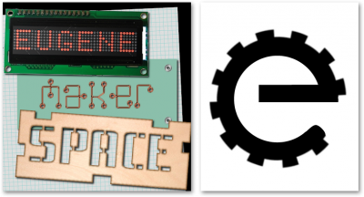
Not much is known of the early history of EMS's logos. Lots of ideas were tossed back and forth in the early days. From an arrangement of 'maker' themed elements forming the words "Eugene Maker Space", to more abstract designs. Which came when is hard to say, and there may have been other ideas bandied about. We know that the "circuit boards" logo was in use in early 2012, as it appeared on the Grand Opening flyer. The early sketch of an "e" gear shape was not put into use, but there seemed to be several members thinking along similar lines.
By January 27, 2013 the now familiar "Gear" logo was uploaded to the website.
| Early Logo Ideas | The Gear Logo |
|
|
| Early ideas showing signs of things to come | I imagine there were many heated debates over whether the circle should be green or white |
2014 Larsen-Swartz Logos
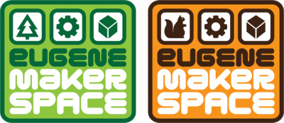
In early 2014, an effort was made to create a new logo in a collaboration between Wade Larsen and Jeremy "Jher" Swartz. A number of logo designs were proposed, and eventually the decision was narrowed to three main logo images. Each of the logos made use of illustrative elements to depict the words The logos depicted a tree, representing Eugene, a gear representing Maker, and a cube representing Space. Several other logo candidates had used similar illustrative devices to achieve similar goals, with one using a squirrel to represent Eugene. A new typeface was used as well, now rendering all parts of the name in a single typeface which featured a more friendly feel, with a cleaner, more modern vibe.
| Proposed Alternatives | Unified Cube Logo |
|
|
| Tree = Eugene, Gear = Maker, Cube = Space. That squirrel was so cute tho! | Cube, Gear, and Tree all stacked together. |
Mixed adoption and practical concerns
Over the next few years, adoption of the Larsen-Swartz designs was uneven across the organization. Banners and signage in the shop showed one logo, business cards and webpages showed another. Some places used both. Online usage had begun to settle into using the 'Unified Cube' logo, but when many social media sites (such as Facebook, Google, Twitter, and Meetup.com) began enclosing userpics in circles as a matter of course, the elongated hexagonal shape of the unified cube logo meant that most sites would cut off the logo.
In Spring 2018, efforts began to try once more to wrangle the shop's growing 'who does this belong to?' problem. A number of tools and pieces of equipment were identified that had either been donated or abandoned, and those that were desired to be kept as shop property we wanted to mark as such. At some point in the past, someone had stuck a "Gear" logo sticker on the shop's beloved Vacuum Former, and the idea of doing something similar utilizing the vinyl cutter, caught on.
Unfortunately, the 'Unified Cube" logomark utilized 5 colors, with no way to easily render the logo in a simple 'black ink on white paper' application. As such, the logo could not easily be made into a stencil, or a single-layer vinyl sticker. By contrast, the original "Gear" logo could manage this effortlessly.
2018 "Fusion" Redesign
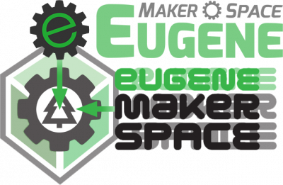
The front window of the shop had, at some point, received a large vinyl application of the text "Eugene Makerspace" as rendered in the Larsen-Swartz logos. Keeping that font, while utilizing the more print/circle friendly "Gear" logo was a solid plan. With the mixed use of both logos in the shop and online, attempting to bridge the gap between the designs seemed like a perfect solution. Refreshing the original "Gear" logo, while Leaning on the bolder 'green/black/white' notes from the Larsen-Swartz logos, and the overall framing and proportions of the "Unified Cube's" presentation, the final design effectively assembled itself.
| Coming together | The Fusion Logo |
|

|
| A little of this, a little of that, stir | ... and Voila! |
